Design System
A design system built to unify GoDryv’s ride-hailing experience for both rider and driver mood, bringing consistency, speed, and scalability across the product.
Overview
GoDryv is a Ride-hailing app that includes two main experiences, one for riders and one for drivers. This design system was created to keep both experiences aligned. It provides shared foundations, reusable components, and clear rules that help us work in parallel while maintaining a consistent look and feel across the app.
By using variables and design tokens, the system stays flexible and easy to scale. It supports changes without breaking consistency and helps designers and developers stay aligned as the product grows.
By using variables and design tokens, the system stays flexible and easy to scale. It supports changes without breaking consistency and helps designers and developers stay aligned as the product grows.
The Problem
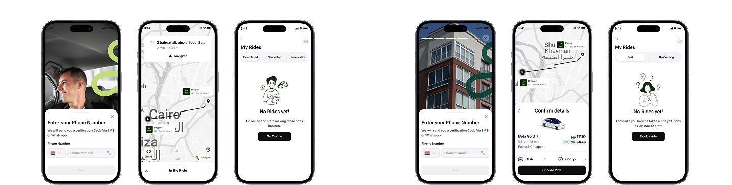
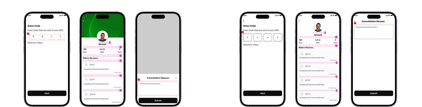
As GoDryv expanded, the Rider and Driver apps were designed separately, each with different flows and priorities. But this created challenges in keeping the final design consistent across both experiences.
Because two designers were working on different modes, matching components and styles took a lot of back-and-forth. Even small updates had to be redesigned and adjusted on both sides, which cost time and effort.
Without a shared design system, keeping both experiences aligned as one product became increasingly difficult.
These examples show differences in the component used, spacing, and layout.
The Approach
I started by reviewing real screens from both the Rider and Driver apps to understand where designs overlapped and to identify repeated patterns. The system was built based on actual needs, focusing on the elements that were causing inconsistency.
After that, I defined shared foundations and built reusable components that could work across both experiences. I used variables and design tokens to keep the system flexible, allowing updates to be made once and applied consistently across both modes.
The system was built step by step, tested on real screens. My focus was to keep things clear, flexible, and easy to reuse, without making the system more complex than needed.
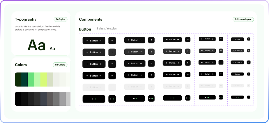
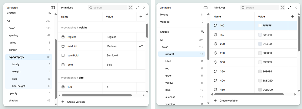
Foundations
I built this foundation by starting from the smallest elements like colors, typography, spacing, and borders. These elements set the visual rules that both the Rider and Driver apps could share.
To manage styles at scale easily, I applied a 3-Tier Token Model:
1. Primitives: raw values like colors, spacing, and typography.
2. Tokens: semantic names that describe how those values are used.
3. Mapped tokens: connections between tokens and actual components.
This setup made it easier to control styles and apply changes without redesigning components.
With this structure, changes could be made once at the foundation level and reflected across the system. This helped maintain consistency between both experiences while still allowing the design system to grow and adapt over time.
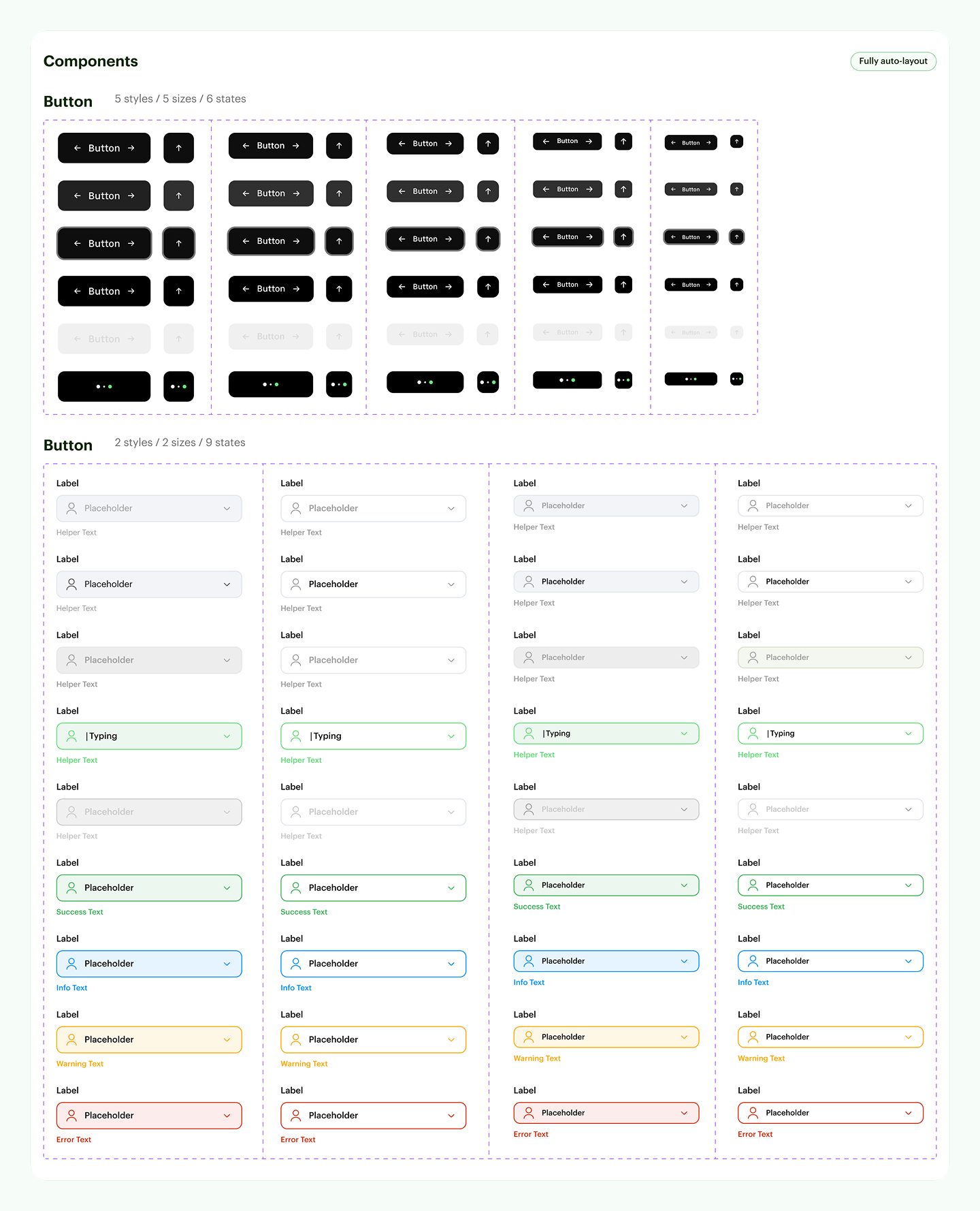
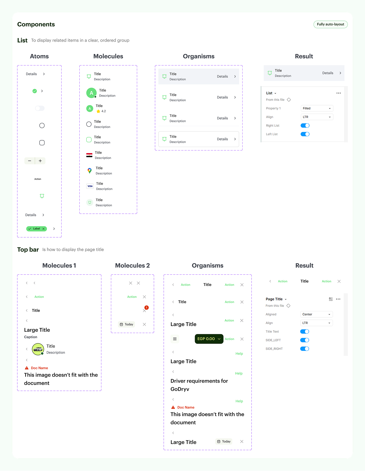
Components & Patterns
After the foundations, I reviewed both the Rider and Driver apps to spot UI elements that were shared between 2 apps, like buttons, inputs, cards, and list items, which were rebuilt as shared components with clear states and variations.
Each component was designed to be flexible, so it could work across different screens and use cases without breaking consistency. Then defined simple patterns for common flows, such as forms and information layouts, to help screens feel familiar and easy to use in both experiences.
By the end, the design system included around 65 components with multiple states and variants.
Impact
- The design system helped unify the Rider and Driver apps into one consistent product. It enabled us to work with shared components and clear guidelines, reducing repetitive tasks and making everyday design processes easier.
- Design work became faster and easier to manage. By reusing components and relying on tokens and variables, screen design was about 30% faster, and small updates no longer required repeated edits across both apps.
- The system also made collaboration smoother. We could work in parallel with more confidence, knowing we were using the same rules and components.
Consequently, the product became easier to scale while maintaining consistency as new features were added.